Pathways
In data representation, colours become even more important than ever. The colour palette of this project represents the different factors that affect cancer care and empowers medical providers and payers to measure quality and cost care.
Time
#0097A7
Cost
#073763
Off Path
#990000
Adverse Events
#FFAB40
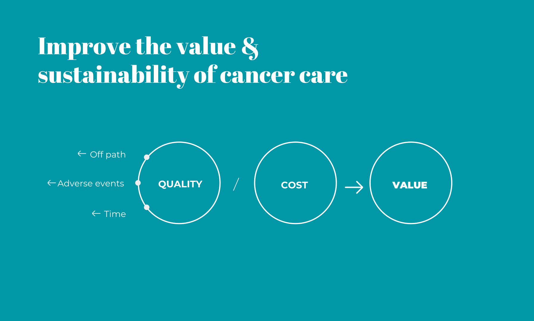
Understanding the user motivations to improve cancer care value
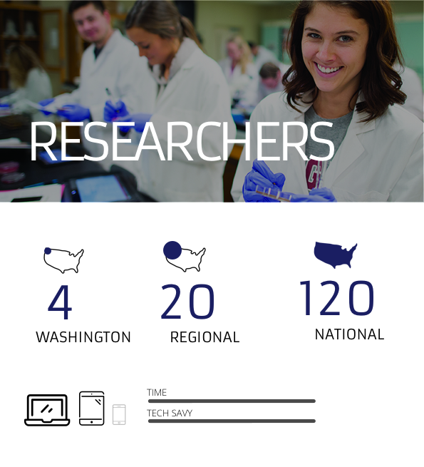
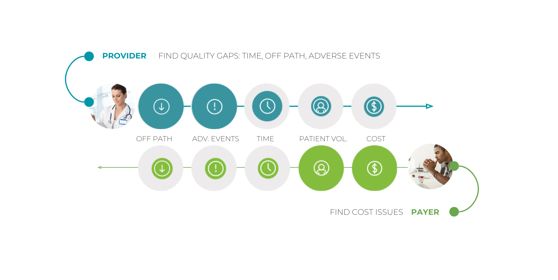
Our research helped to understand the motivations of users within the health care system. We worked closely with the clinical team to understand the problems and needs in delivering value-based care across the chain. We needed to understand the humans behind the stethoscopes and statistics.
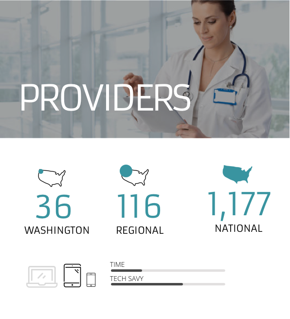
The providers wanted to illuminate quality gaps in the administered care. The providers include medical directors and physicians that compare patient care outcomes with other providers, measure improvement over time and monitor standards of adherence.
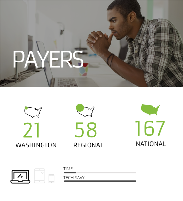
The payers wanted to better identify cost issues to provide value-based care. The payers include national account managers and contracting departments that want to evaluate reimbursement models and providers on a value-based system.
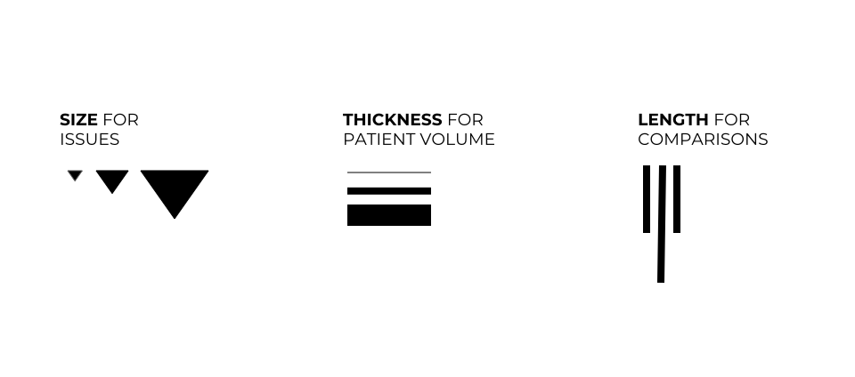
Consistent symbols
A system of consistent symbols will represent quantities and issues along the path that affect the cancer care in different ways.
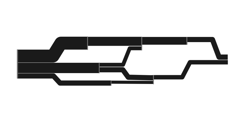
Representative path
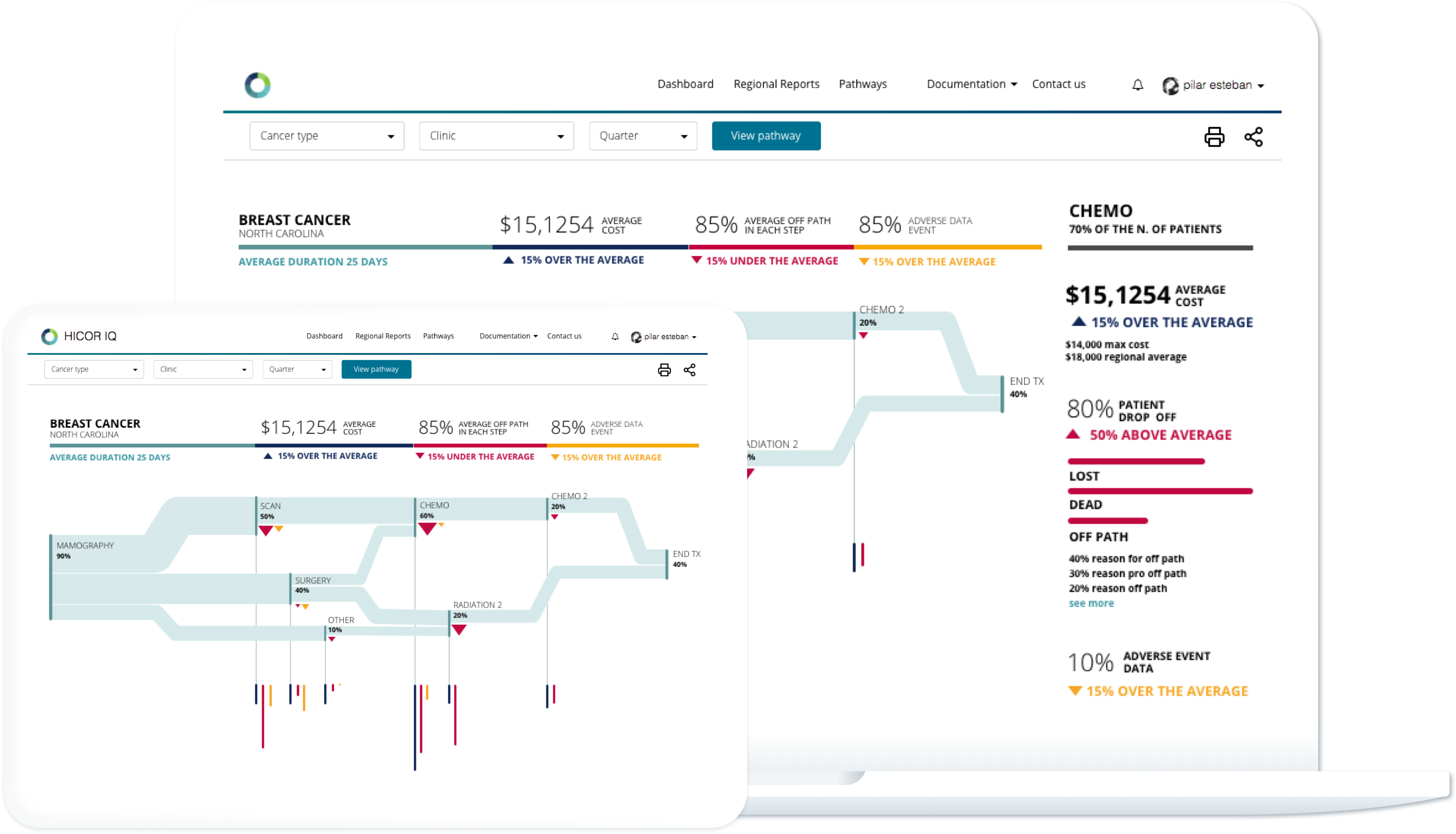
A tree structure was the best way to present the patient pathways along the cancer care, and how the weight is distributed and valued.
From the big picture to the relevant detail
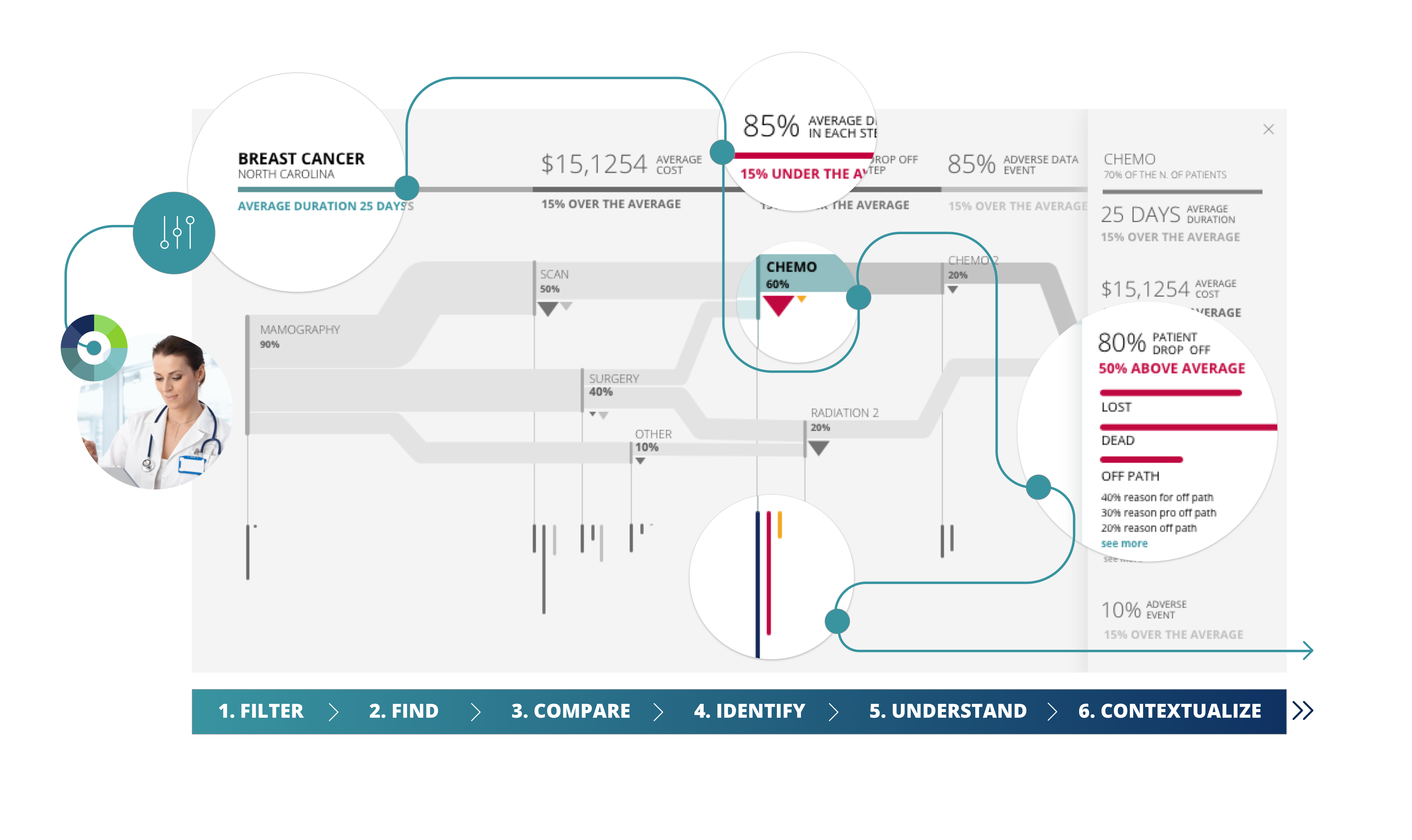
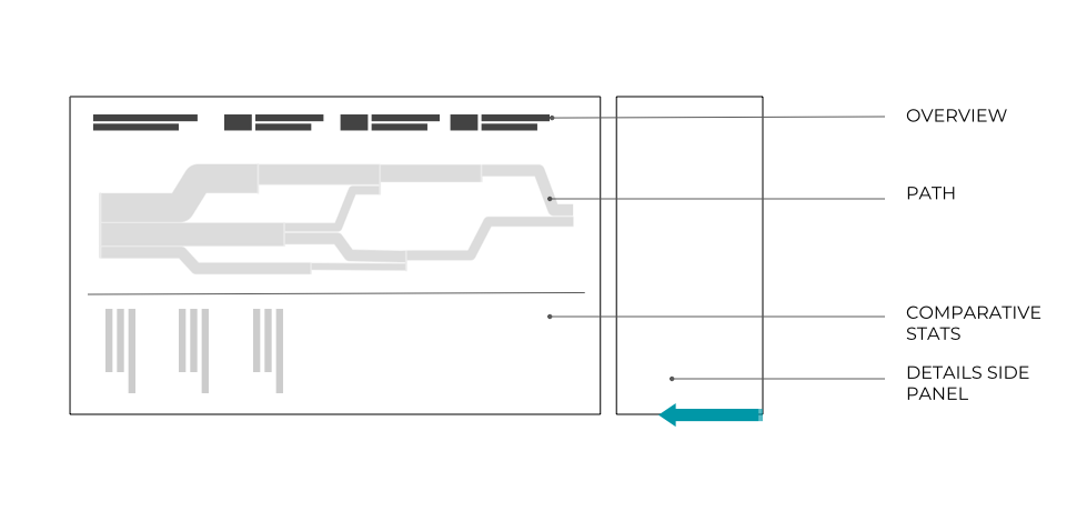
The screen hierarchy is defined in a way that makes easy to understand the higher level of info and dig deeper in the areas that are interesting in each case for each user type.
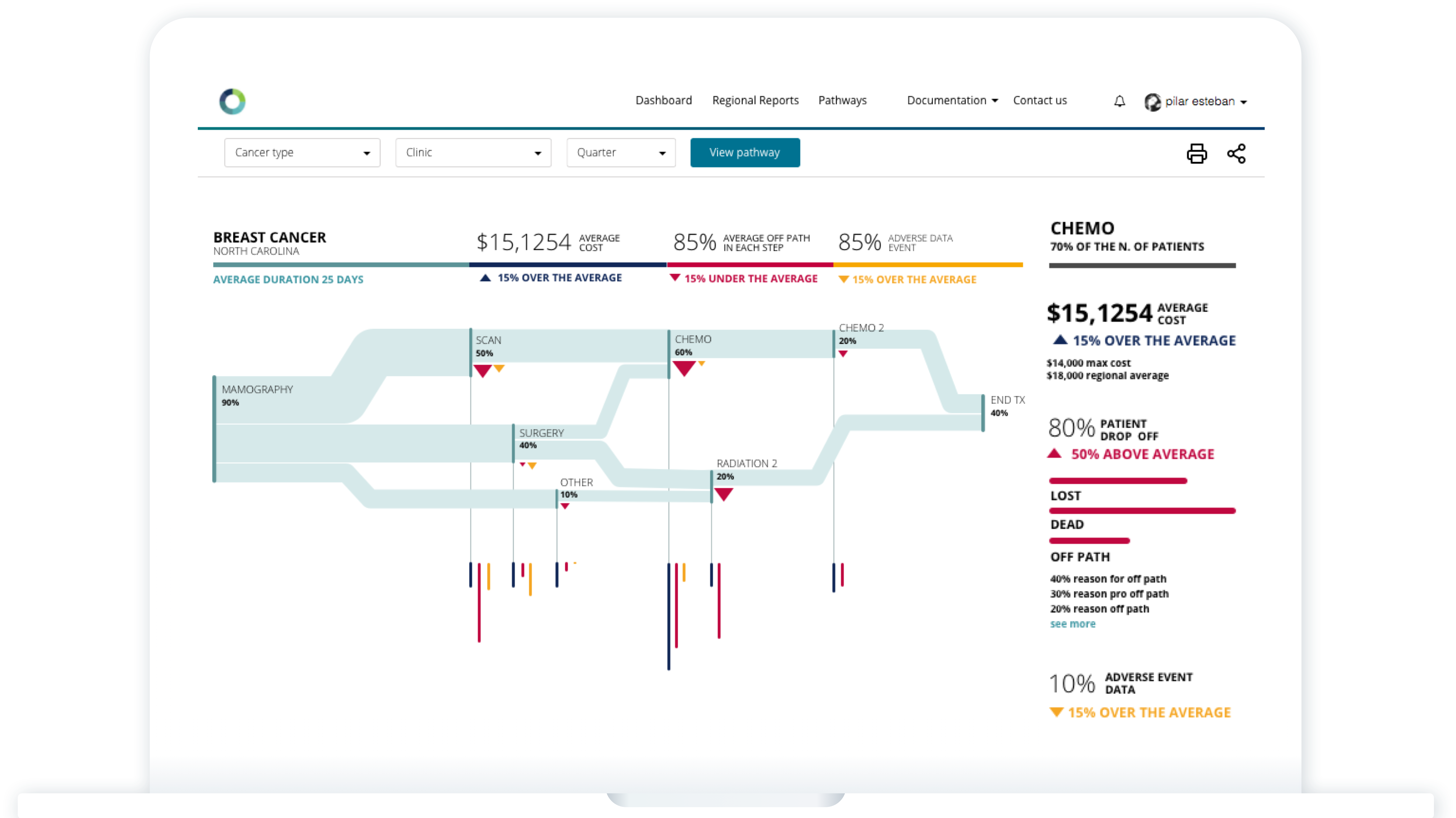
Enabling better decisions
The user defines the initial filters.
They can easily can view a quick snapshot of the main pathway data at the top. The graphic visualisation of the pathway allows the user to identify anomalies and compare against other areas.
Also, they can dig deeper when needed, contextualising the info and comparing different metrics, in order to answer the user’s question, take actions and facilitate informed decisions that will improve the cancer care value.
