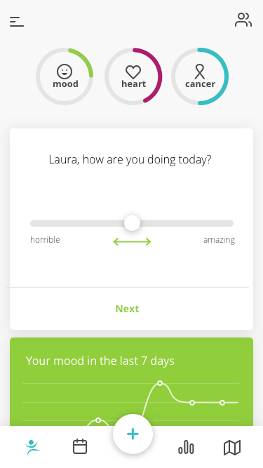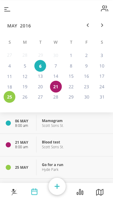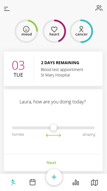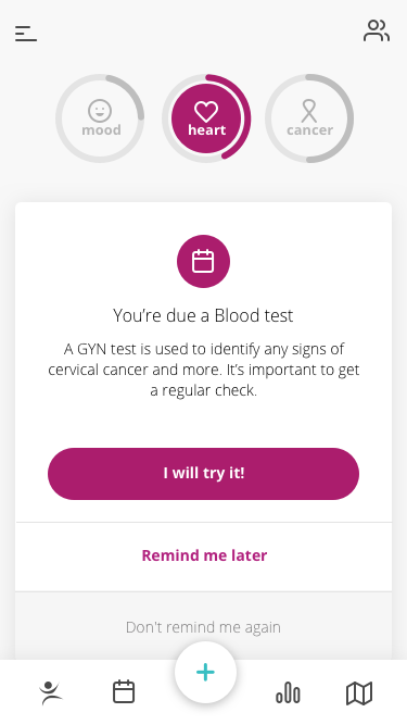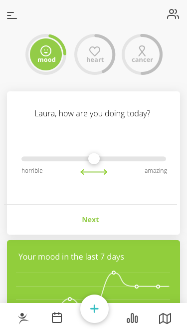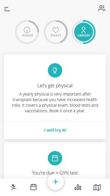
Inspire app
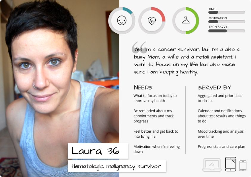
I worked with the Fred Hutch Cancer Research Center, one of the leading cancer care providers globally, to research, conceptualize, and design an app that makes it easier for cancer survivors to follow their care plans after hospital discharge, applying behavioural change and game theory.
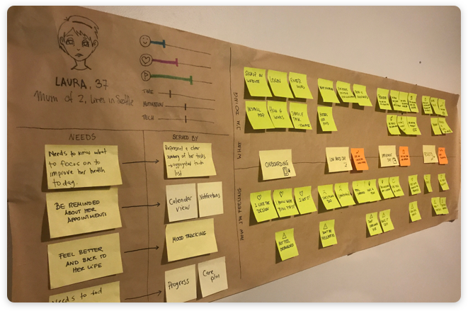
Throughout the process, we collaborated with doctors, patients, and families to identify the biggest opportunities to create an engaging experience. We combined product analytics and close feedback loops to iterate and develop a game-changing support system.
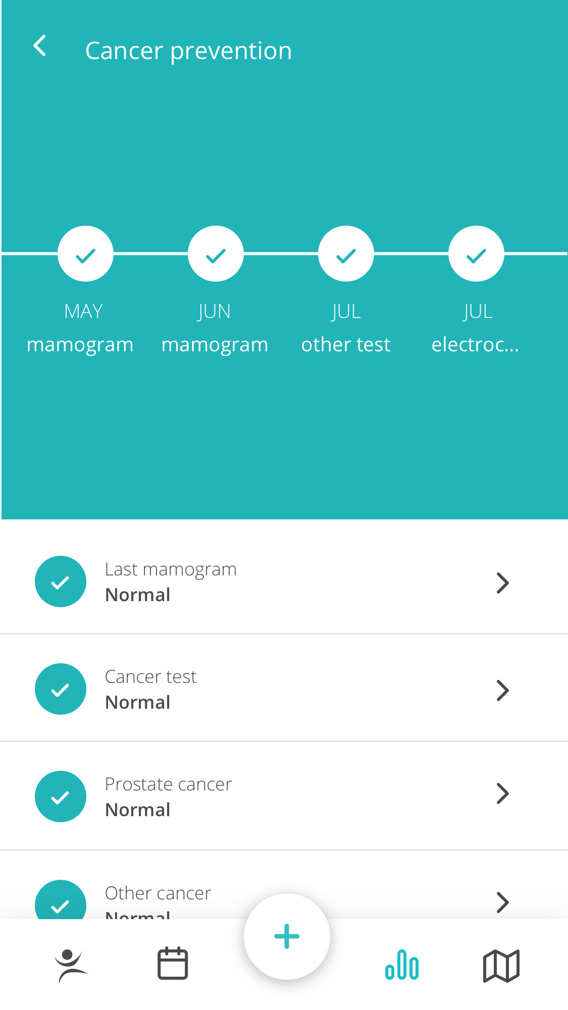
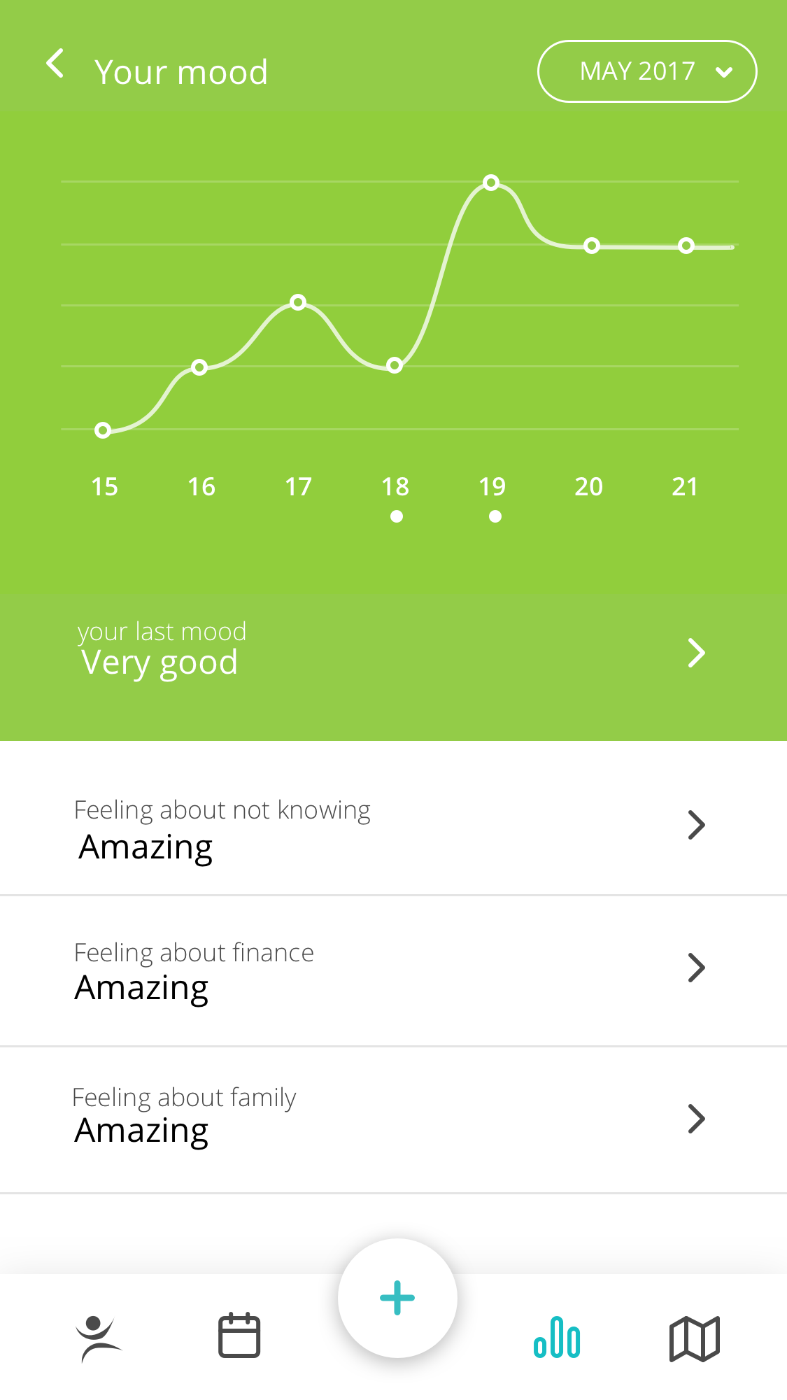
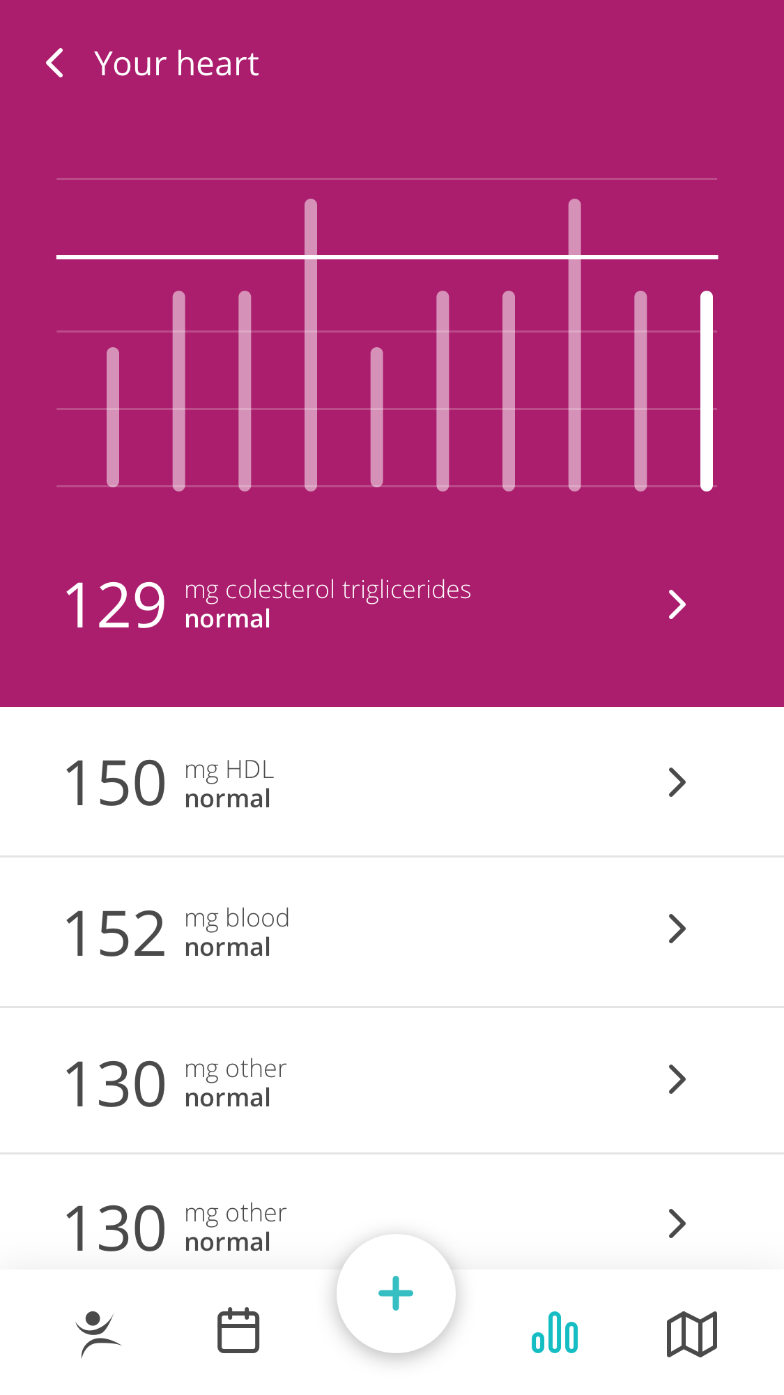
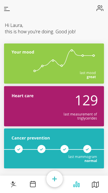
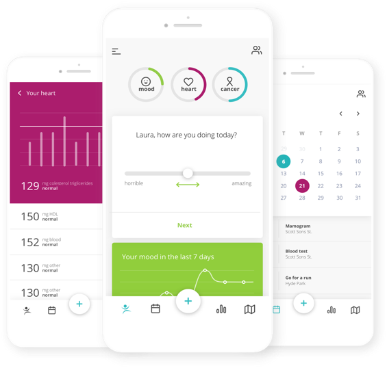
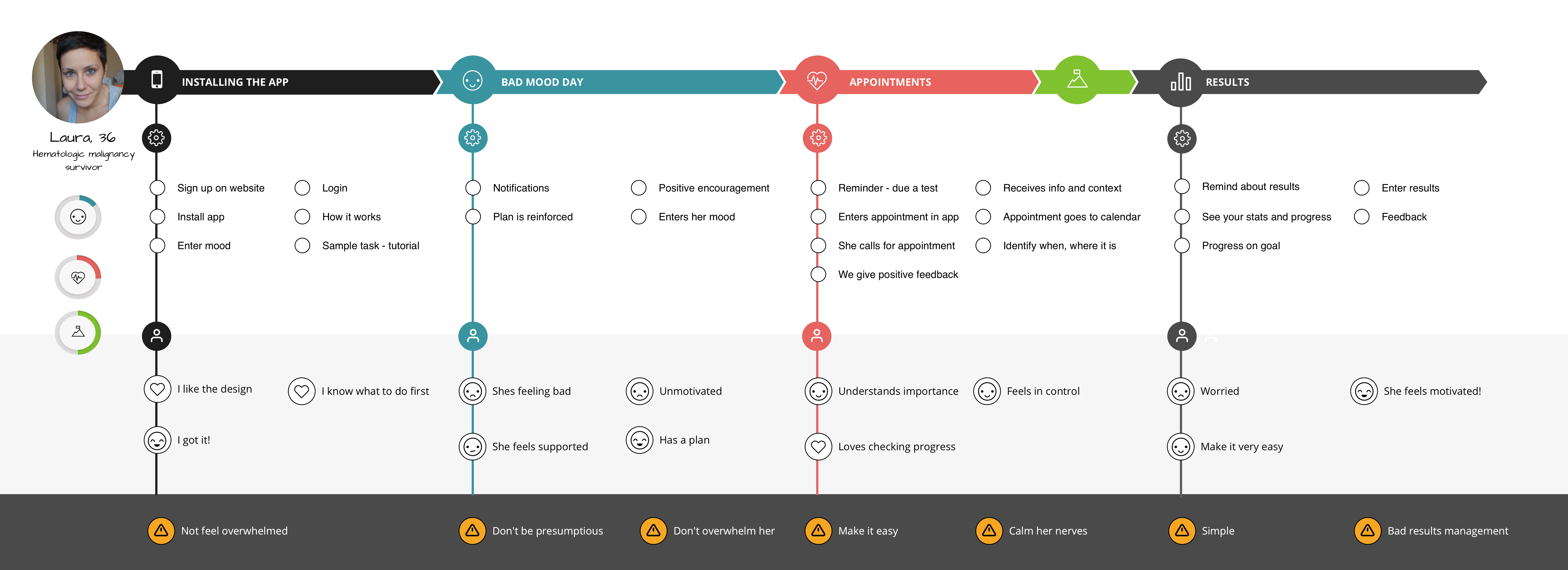
Effective health treatment needs to move out outside of the hospital and into people’s daily homes and lives. Bright, clean and simple branding makes easier to follow the steps to improve the life of the patients, focusing on the main areas of cancer prevention, hearth and mood.
Heart Care
#AB1D6D
Mental Health
#93CC48
Cancer care
#21B4B8
The goal: save lifes
The goal is to make it easy for survivors to follow the care plan, after they exit the hospital.
Motivate survivors to manage their health and wellbeing after clinical treatment through personalised advice and support to improve wellbeing.
Enable survivors to improve the success of their treatment by tracking medication, test results and data to improve survivorship.
Creating health habits
Old habits are hard to break, but through repetition it’s possible to form good new ones.
Build a motivating chain of done habits and perfect days.
Focus on just the right habits for the day, don’t overwhelm with too much to do.
Trigger and build upon habits through helpful reminders. Positively encourage good done habits.
Focus
Don’t overwhelm the user with too many options, focus in what is important
Motivate
Give the user feedback and keep them motivated, it’s a long term run.
Holistic
A balanced and holistic approach to the user’s health from all the relevant areas
The final designs
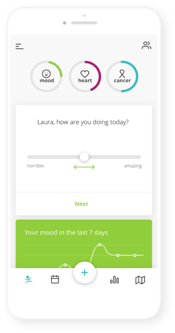
When it came to the visual language, we defined how we wanted users to perceive the app: Clean, Optimistic, Simple and above all Human. From that personality statement it was easy to evolve to a design that feels simple and easy to use, clean but also colourful. We landed at a white, minimal interface using the bright colours as an character accent, always aligned with the main three focus of health care: heart health, mood and cancer care.

